Рецепта · сайт
Bravoto · Стената с афишите: огради с маркер това, което обичаш
Тенденции: Мек брутализъм + Ръчна илюстрация и смесени техники. Концепция на Better Mechanics по рецептата — не е официалният сайт на марката.
Доказателството
WEB · BRAVOTO-BRUTALIZAMREV 0.1
- axe serious
- 0
- overflow 360
- 0 px
- weight
- 156 KB
- h1
- 1
- lang
- bg
- date
- 2026-10-19
провереноaxe (WCAG 2.2 AA) в светла и тъмна тема · 360 px · автоматично; ръчният преглед предстои
(а) Многократният промпт (EN, неутрален към марката)
Build a single-file homepage for a city "what's on" guide for children and young
people. Tone: joy first. The visitor should feel like a kid standing in front of a
poster wall with a marker in hand. Soft brutalism carries the structure; one
coherent hand-drawn line system carries the joy.

TRENDS
- Soft brutalism: thick visible borders (2.5px, light ink on a dark surface),
  hard offset shadows with NO blur (5-10px, in the category colour), small radii
  (10-14px), direct heavy display type, disciplined spacing, a limited palette
  (brand dark, one card surface, one accent, one colour per category).
- Hand-drawn illustration: ONE line system for everything - same stroke width,
  round caps/joins, currentColor, drawn in inline SVG <symbol>s (one doodle per
  category + stars, wave underline, arrow). Every path uses pathLength="1" so
  it can "draw itself" (stroke-dashoffset 1 -> 0). Decoration is aria-hidden and
  separate from semantic content; no text inside drawings.

LAYOUT (desktop -> one column at <=620px; HTML order = reading order)
+------------------------------------------------------------+
| WORDMARK              nav anchors          [Ghost CTA]      |  sticky, bottom border
+------------------------------------------------------------+
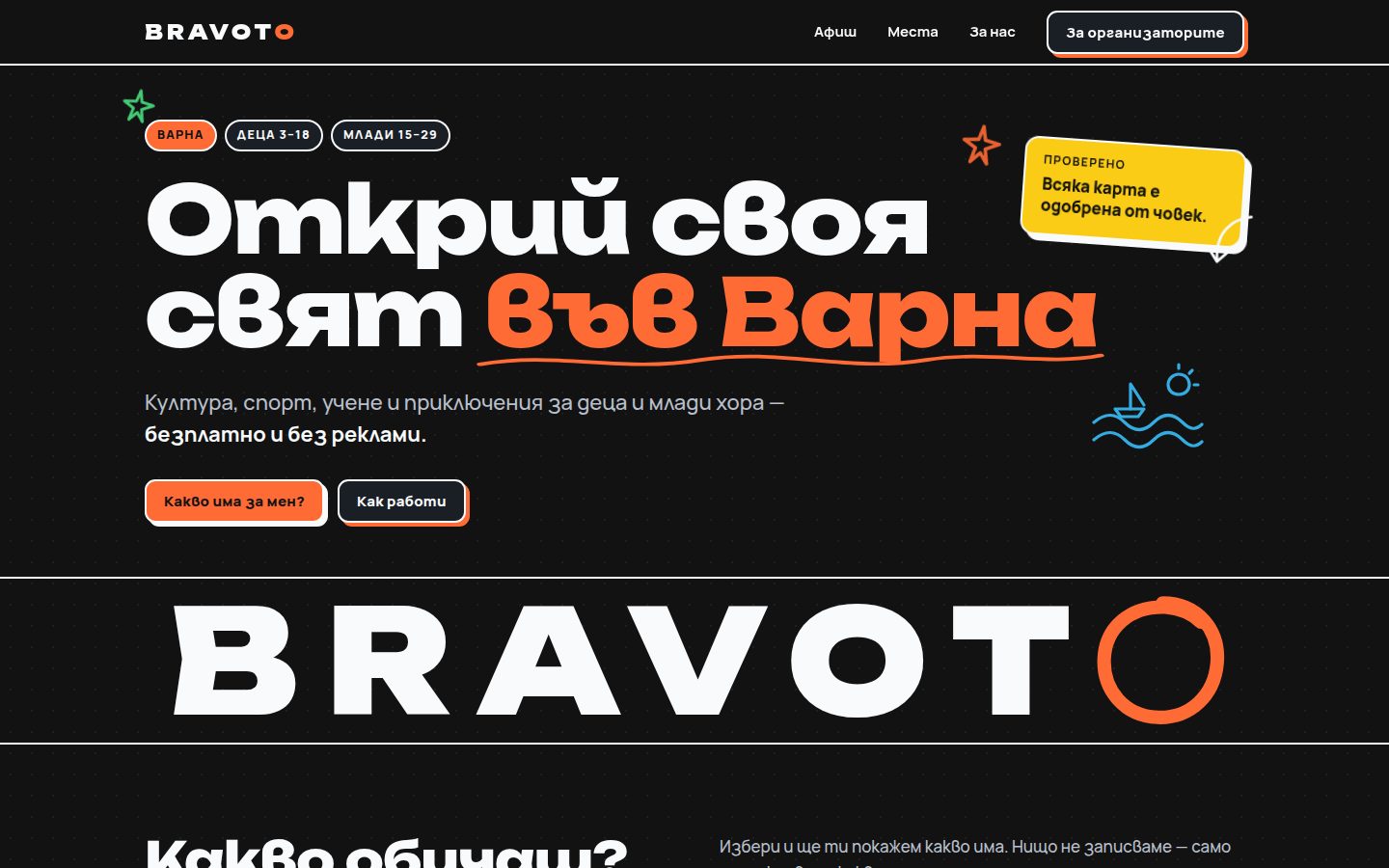
| tag pills (city · ages)                     * doodle star   |
| HUGE 2-LINE HEADLINE, last words in accent   [rotated       |
|   with a self-drawing wavy underline          sticker: the  |
| one-sentence promise                          trust promise]|
| [Primary CTA] [Ghost CTA]                     ~ sea doodle  |
+============================================================+
|  B R A N D W O R D M A R K ( )  <- last letter is a marker  |  full-bleed band,
|                                    ring that redraws in the |  aria-hidden
|                                    selected category colour |
+============================================================+
| H2 "What do you love?"      note: nothing is stored          |
| [All] [Cat1] [Cat2] [Cat3] [Cat4] [Cat5] [Cat6]  aria-pressed|
| live status line                                             |
| +--------+ +--------+ +--------+   poster wall (3/2/1 cols)  |
| |doodle  | |doodle  | |doodle  |   each poster: tinted art   |
| |TITLE.  | |TITLE.  | |TITLE.  |   panel + title + one line  |
| |chips   | |chips   | |chips   |   + keyword chips + "I love |
| |[I love]| |[I love]| |[I love]|   this" toggle             |
| +--------+ +--------+ +--------+                             |
+------------------------------------------------------------+
| HOW IT WORKS: 3 numbered bordered cells in one framed strip  |
+------------------------------------------------------------+
| NEAREST TO YOU: doodle compass + "you" dot | text + button  |
|   location is used only in the browser, never stored/sent   |
+------------------------------------------------------------+
| FOR ORGANISERS: 3 numbered ways | 2 price cards (free/paid)  |
+------------------------------------------------------------+
footer: publisher line + concept label

THE ONE MEMORABLE INTERACTION
Picking a category (from the picker OR from the poster's own toggle - both
mirror one state) makes the chosen poster lift, tilt and get circled by a
hand-drawn marker loop that draws itself around it; the other posters go quiet
(dashed border, flat shadow, desaturated art) but keep full text contrast; the
big wordmark's last letter (a marker ring) redraws in the category colour; one
polite live region says what is shown. Pressing again returns to "All".

BUTTON STATES (real, tactile)
rest: border + hard shadow in its colour · hover: lifts (-2,-3) and the shadow
grows, the doodle wiggles · active: presses INTO the shadow (translate = shadow,
shadow 0) · selected (aria-pressed=true): filled with its colour, dark text,
shadow switches to ink, icon pops · focus-visible: 3px dashed ink outline with
offset · busy (aria-busy) for the location button.

MUST
- Real brand content only; drop any section without source content. No invented
  events, dates, venues, prices, people, testimonials or counts.
- Audience is children: no personal data collected, no forms for kids, no fear
  language, joy first. Location (if offered) only on click, only in the browser.
- One h1; sections with aria-labelledby; role="group" for the picker (buttons,
  not list items); one aria-live status.
- Contrast WCAG 2.2 AA: if a category colour is too dark for text, use a lighter
  tint for fills/text and keep the original for shadows/doodles (3:1 non-text).
- prefers-reduced-motion: no drawing/wiggle/lift animation; final states shown.
- No horizontal scroll at 360px; flex items that must not shrink get flex:none.
- Self-hosted fonts with correct local forms (lang set); no CDN; < 1 MB.
- <link rel="icon" href="data:,">; concept label in the footer.

FORBIDDEN
Blinking colours, deliberately ugly layout, unreadable mono paragraphs, chaos
without a system, mixed illustration styles, stock/AI people, text inside
pictures, decorative alt text, blurred "glow" shadows, purple gradients.
(б) Бриф за Bravoto
- Идея: детето стои пред стена с афиши и с маркер огражда онова, което обича. Изборът на категория (горе или „Това обичам“ на самия афиш) повдига и наклонява афиша, около него се дорисува маркерна линия, другите утихват (пунктир, без цвят в рисунката, но с пълен контраст на текста), а „O“-то в голямото BRAVOTO — маркерен кръг, както е и знакът на сайта — се дорисува в цвета на категорията.
- Съдържание (само от живия сайт): „Открий своя свят във Варна“ · „Култура, спорт, учене и приключения за деца и млади хора — безплатно и без реклами.“ · Варна · деца 3–18 · млади 15–29 · „Всяка карта е одобрена от човек“ · категориите Всички · Култура · Спорт · Учене · Приключения · Книжки · Море и думите, по които сайтът ги разпознава (кръговете „Култура“, „Спорт и младежта“, „Образование“; поход, екскурзия, лагер, обиколка; читалище, библиотека, книги, четене, приказки; море, плаж, аквариум, делфини, яхти, плуване, ветроходство) · „Какво обичаш?“ + „Нищо не записваме — само ти показваме какво има“ · Събираме / Проверяваме / Пазим децата · „Най-близо до теб“ + „Местоположението ти се ползва само в браузъра — не го пазим и не го изпращаме.“ · трите начина за организаторите · 0 € / 10 € месечно · 100 € годишно · „Таксата не дава предимство в афиша“ · издател Фондация „Източен Акселератор“, платената част КАГАМИ ЕООД, част от VarnaHub.
- Цветове:
#121212(фон „обсидиан“),#1a1f26(карта),#FF6B35(оранжево; Спорт),#F9FAFB(текст и рамки). Категориите:#00E5FFУчене,#facc15Приключения,#4ade80Книжки,#38bdf8Море; Култура —#9D4EDDна живия сайт, тук изсветлено до#C084FCзаради контраста на тъмен текст върху пълнеж (4,07 → 7,09). - Шрифтове: Unbounded (заглавия и знакът) + Manrope (текст), от
../_obshto/fonts/. Живият сайт ползва Plus Jakarta Sans/Inter от Google — забранени в галерията. - Знак: типографското „BRAVOTO“ (тегло 900, разреден ред .18em, оранжево „O“) от
nav.js; голямото „O“ е маркерен кръг — поfavicon.svg(оранжев пръстен). - Тема: само тъмна — така е марката; светла няма.
- Пропуснато нарочно: седмицата по дни, афишът на седмицата, „Скоро“, картата с места и броячите (без истински данни биха били измислени); бюлетинът (формуляр с имейл — не за деца в концепция).