Рецепта · сайт
Галин Димитров · Пристанището: приливът вдига думите
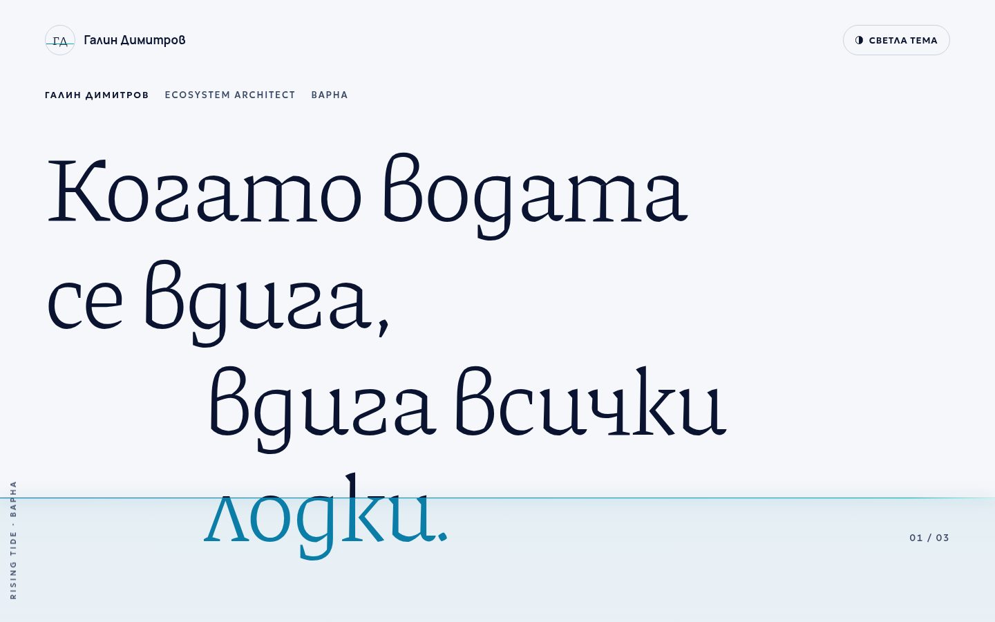
Тенденции: Огромни заглавия, малко текст + Тъмна тема по подразбиране + Разчупена мрежа, органични композиции. Концепция на Better Mechanics по рецептата — не е официалният сайт на марката.
Доказателството
WEB · GALIN-GOLYAM-SHRIFTREV 0.1
- axe serious
- 0
- overflow 360
- 0 px
- weight
- 223 KB
- h1
- 1
- lang
- bg
- date
- 2026-10-19
провереноaxe (WCAG 2.2 AA) в светла и тъмна тема · 360 px · автоматично; ръчният преглед предстои
(а) Многократният промпт (EN, неутрален към марката)
Build a single-file personal-brand homepage called "The Harbour": one thought told in
three enormous typographic moves, with almost no other text, on a quiet dark page
crossed by a single line of light, the horizon.
The idea: "rising tide lifts all boats". The horizon is fixed to the viewport and
rises as the reader scrolls (from ~80% to ~32% of the viewport height). Every glyph
below the line is "in the water" and changes colour exactly where the line crosses
it, mid-letter. The water lifts the words; nothing else moves.

TRENDS: "Huge headline, little text" + "Dark theme by default" +
"Broken grid, organic composition".

LAYOUT (desktop · phone = one calm column, no offsets, no overlap)
+---------------------------------------------------------------+
| (monogram) Name                               [o Light theme] |
|                                                               |
| NAME   ROLE   CITY                        (small label)       |
| MOVE ONE, LINE 1                                              |
| MOVE ONE, LINE 2                                              |
|        MOVE ONE, LINE 3 (indented)                            |
| ======= horizon (fixed, gradient, soft glow) ============01/03 |
|        move one, line 4 (already in the water)                |
|                                                               |
|      02/03     MOVE TWO, LINE 1 (starts at column 4)          |
|                    move two, line 2 (light weight, muted)     |
|                                                               |
| 03/03                  MOVE THREE, SMALL WORD (indented)      |
| MOVE THREE, THE ONE GIANT WORD, ALMOST EDGE TO EDGE           |
|                                  caption: the idea's name,    |
|                                  one sentence (columns 8-12)  |
|---------------------------------------------------------------|
| CLOSING LINE, LARGE           | ROLE · CITY                   |
|                               | one verified fact + link      |
|                               | [ Primary profile  -> ]       |
|                               | Profile 2   Profile 3         |
| footer: name · role · city   |   concept disclaimer           |
+---------------------------------------------------------------+
| vertical label on the left edge (desktop only, aria-hidden)   |

MUST
- Each headline line is a block span. JS sets --cut = (horizonY - line.top) px per
  visible line; CSS paints the line with a hard-stop linear-gradient (above colour ->
  water colour at --cut) and background-clip:text. Keep a solid `color` fallback so
  the page is complete without JS and contrast checkers read real colours.
- Pad each line (padding-block ~.16em with equal negative margin, a little right
  padding) so ascenders, descenders and diacritics stay inside the painted box;
  verify with a Range bounding box that no glyph overflows its line box.
- Horizon = fixed 1px gradient line + soft glow; under it a fixed, faint tint that
  fades out (the water). Both aria-hidden, pointer-events:none, behind the text.
- On load the horizon rises once from the bottom (~1.8 s, ease-out) and one spark of
  light runs along it once. No loops. prefers-reduced-motion: the horizon stays
  still at ~62%, no spark, no transitions; colours still follow the line.
- One rAF-throttled scroll/resize handler; recompute after fonts load.
- Dark first: layered navy surfaces (not #000). Light theme via the system
  preference and a remembered toggle (aria-pressed, localStorage in try/catch).
- One h1 = the first move; moves two and three are h2. Semantic source order equals
  the reading order; asymmetry comes only from grid columns and margins.
- Fluid sizes with clamp()/min(); the giant word must fit at 320 px; no negative
  tracking beyond -0.015em on Cyrillic; lang set; self-hosted fonts with the right
  locale forms (Bulgarian: locl BGR).
- A typographic monogram instead of a portrait when no real photo is provided.
- Only verified facts from the brand book; links only to the listed profiles.

FORBIDDEN
- Any other text block, cards, stats, testimonials, logos wall, invented numbers.
- Centred hero, purple "AI" gradients, glass, stock photos, autoplay, endless motion.
- Text in canvas; overlap on phones; horizontal scroll at 360 px.
- External CDNs or Google Fonts.

TECH
- One HTML file, inline CSS + ~60 lines of vanilla JS, no libraries.
- WCAG 2.2 AA in both themes (water colour on dark >= 7:1; on light >= 3:1 for the
  huge type only, small text stays in the text colours); focus-visible on every
  control; 44 px targets; page < 1 MB without fonts.
(б) Брифът за Галин Димитров
- Идея: „Когато водата се вдига, вдига всички лодки. Затова не градя една лодка. Градя пристанището.“ Rising Tide: системи, в които печелят всички. Три хода, нищо излишно: хоризонтът се вдига със скрола и „потапя“ думите буква по буква. Последният ход, „пристанището.“, е най-голямата дума на страницата.
- Ходовете: h1 „Когато водата / се вдига, / вдига всички / лодки.“ · h2 „Затова не градя / една лодка.“ (втората половина тънка и приглушена) · h2 „Градя / пристанището.“ · надпис „Rising Tide — всички лодки нагоре. Системи от системи, в които печелят всички.“ · накрая „Да поговорим.“ + фактът + профилите.
- Факти: само „Основател и управител на КАГАМИ ЕООД, Варна.“ и „Ecosystem Architect · Варна“. Без снимка: монограм „ГД“ в Piazzolla, пресечен от линията на хоризонта.
- Връзки: LinkedIn (основният бутон), Facebook, Instagram; kagami.bg към фактa.
- Цветове (tokens.json): тъмна тема (по подразбиране) — фон #0A1430 (марковият „tekst“), повърхност #0F1B3A, текст #F6F7FA, приглушен #8E9CB6 (6,4:1), водата #0ABFB0 (7,9:1), хоризонтът — лентата
#0B7EA8 → #0ABFB0. Светла тема — дословно светлите токени: #F6F7FA / #0A1430 / #3B4A66, водата #0B7EA8 (4,3:1, само за огромните заглавия). - Шрифтове: марката е Playfair Display + Manrope + JetBrains Mono. Playfair и JetBrains Mono са забранени по заданието (нямат българските форми), затова:
- заглавията: Piazzolla 300/400 (сериф вместо Playfair; българските форми „д“, „л“, „г“, „в“ се виждат при огромния размер);
- етикетите и номерата 01/03: Geologica (вместо JetBrains Mono);
- текстът: Manrope (както в марката).