Recipe · site
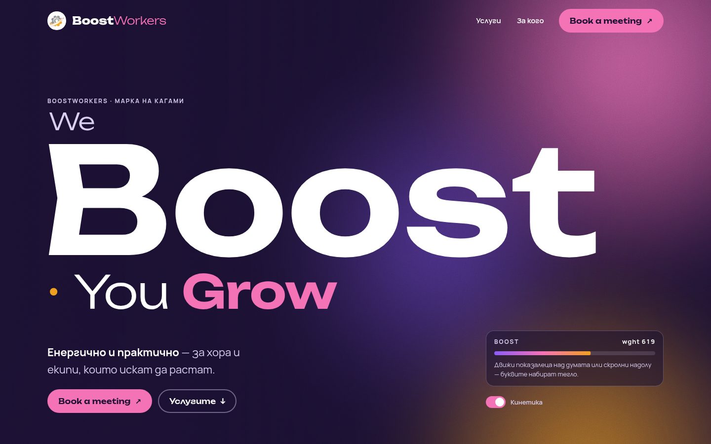
BoostWorkers · Kinetics — the word Boost really gains weight
Trends: Kinetic variable typography + Grainy mesh gradients. A Better Mechanics concept by recipe — not the brand's official site.
The proof
WEB · BOOSTWORKERS-KINETIKAREV 0.1
- axe serious
- 0
- overflow 360
- 0 px
- weight
- 183 KB
- h1
- 1
- lang
- bg
- date
- 2026-10-19
checkedaxe (WCAG 2.2 AA) in light and dark theme · 360 px · automatic; manual review pending
(a) The reusable prompt (EN, brand-neutral)
Build a one-page homepage concept for <BRAND> where the brand's key verb LITERALLY does what it says.
The verb (e.g. "Boost", "Grow", "Lift") is set huge in a variable font and its weight axis reacts to the
visitor: letters near the pointer swell to the maximum weight while the rest thin out; scrolling through
the hero pushes the whole word heavier. Behind it sits a grainy mesh gradient made from the brand's own
colours (CSS radial blobs + a static SVG feTurbulence grain), drifting a few dozen pixels with pointer and
scroll only — never on an idle loop.

Trends: kinetic variable typography (1 axis: wght) + grainy mesh gradient (CSS/SVG first, no WebGL).

Layout (desktop):
+--------------------------------------------------------------+
| [logo] Brand                       Services  Who   [CTA pill] |
|                                                   ~~mesh~~    |
| EYEBROW · brand fact                             ~~ blobs ~~  |
| We                                                            |
| B O O S T   <- one line, variable weight, fitted to width     |
| · You Grow  <- second key word grows with the first           |
| one-line promise              [ live meter: wght 478 ▮▮▮▯ ]   |
| [CTA] [secondary ↓]           [ toggle: Kinetics on/off ]     |
|================ brand gradient strip (6px) ===================|
| 01 — Services        | short intro                            |
| 01  SERVICE NAME (huge, thin → bold when centred) | local name |
| 02  ...  (row closest to viewport centre is "on":             |
|          weight 820, gradient underline grows)                |
|--------------------------------------------------------------|
| 02 — Who it is for (tinted second background, grain)          |
| "A partner who / acts, / measures / and improves."            |
|   -> each verb gains weight in turn as you scroll             |
| [audience card A]  [audience card B]                          |
| • location line                                               |
|--------------------------------------------------------------|
| 03 — Meeting (mesh again, warm-heavy)                         |
| BOOK A / MEETING ↗  <- giant mailto link, letters swell       |
|                       under the pointer                      |
| real e-mail  [Copy address → "Copied ✓" + aria-live]          |
|--------------------------------------------------------------|
| footer: wordmark, slogan, legal owner, concept label          |
+--------------------------------------------------------------+
Mobile: same order, one column; blobs move to the top, scrim turns vertical.

MUST
- Real HTML text for every animated word (visually hidden full phrase for screen readers; letter
  spans aria-hidden). One h1. Only ONE axis animated (wght). Each kinetic word on its own nowrap line
  with fixed line-box height, so nothing below it ever reflows.
- Fit the hero word with JS: measure it at MAX weight in the display font (after document.fonts.load)
  and size it to ~98% of the column — it must never overflow at 360 px.
- One-time "ignition" on load (thin → medium, ~1.3 s), then motion only in response to pointer/scroll.
  rAF loop stops itself when values settle.
- A visible "Kinetics" switch (aria-pressed) and prefers-reduced-motion: both freeze every word at a
  readable static weight, mark all list rows active, and stop the mesh.
- Grain: static SVG noise tile, opacity ~0.15, blend overlay. A quiet dark scrim keeps a high-contrast
  zone behind all text (WCAG 2.2 AA).
- Brand colours only; add a warm third colour only if it comes from the brand's own logo.
- Button states: hover (weight up + arrow nudges), active (press), focus-visible (3px ring in an accent
  colour). Copy-to-clipboard with fallback and a polite live region.
- Self-hosted fonts with Bulgarian locl (lang="bg"), no CDN, no external images, < 1 MB without fonts.

FORBIDDEN
- Text as image/canvas; continuous/looping animation; letter-by-letter on paragraphs; jumping lines;
  the generic purple-blue AI gradient; coarse grain; WebGL for decoration; centred hero + three cards;
  invented clients, numbers, results, testimonials or prices.
(b) The brief for BoostWorkers
- Language: the page is
lang="bg"; the slogan, service names and call to action are in English (lang="en"), as per the brand kit; explanations are in Bulgarian. - Hero: „We Boost · You Grow“ — Boost is the kinetic word (Unbounded 200–900); Grow adds weight and scale alongside the average weight of Boost. Above the word: “BoostWorkers · a KAGAMI brand”. Below it: “Energetic and practical — for people and teams who want to grow.” (from Voice). A small device shows the current
wght, making the trend visible. - Services (6): Business Analysis · Vision & Brandbook · Marketing Strategy · Storytelling · Web Development · Social Networks, with a Bulgarian translation next to each.
- For whom: “A partner that acts, measures and improves.” + both audiences: small and medium enterprises seeking a true digital presence; founders and managers. Location: Varna and Bulgaria · online across Europe.
- Call to action: „Book a meeting“ →
mailto:office@boostworkers.com+ “Copy address” button. - Colours (tokens.json): background
#1A1030, secondary background#2A1850, text#FFFFFF, secondary#D9CFF0, accent/CTA#F472B6, secondary accent#8B5CF6, text on CTA#1A1030, barlinear-gradient(90deg,#8B5CF6,#F472B6). Third, warm colour#F0A020— taken from the arrow in the symbol (the logo), to avoid the “purple-blue AI gradient”. - Fonts: Unbounded (headings, the kinetic word) + Manrope (text; the brand font) from
../_obshto/fonts/. JetBrains Mono from the brand kit was not used (forbidden by the brief); labels are Manrope 700 with tracking. - Theme: only dark, because the brand tokens are identical for both themes.
- Discarded: pricing plans (Standard/Extra/Premium in
extensions.json) — per the “no prices” instruction; LinkedIn/Facebook channels — no addresses in the brand project.