Recipe · site
East Accelerator · Community Cover
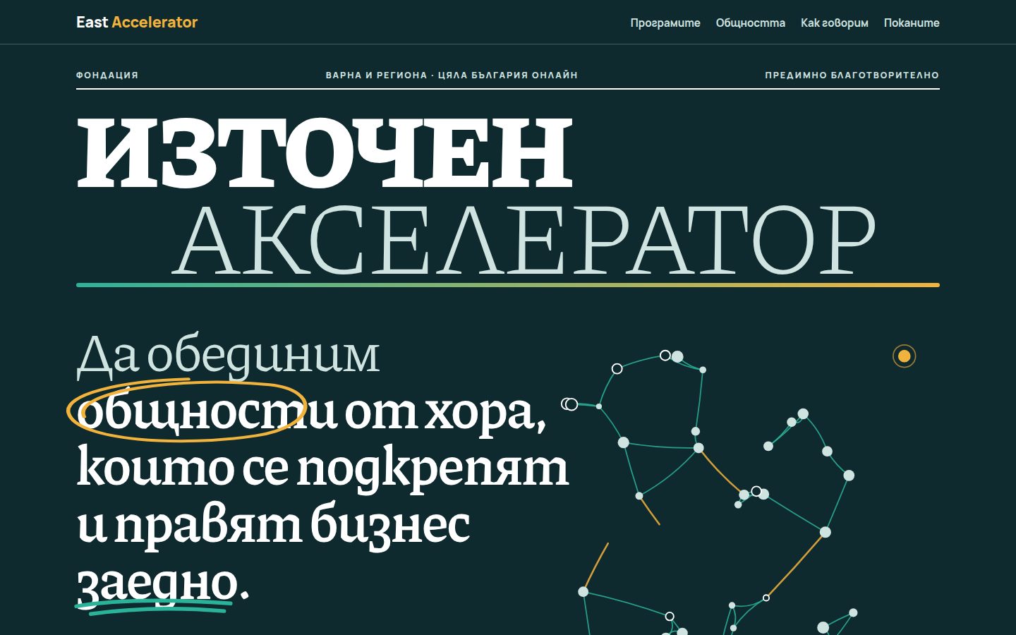
Trends: Editorial layout (magazine-style) + Broken grid, organic compositions + Hand-drawn illustration and mixed media. A Better Mechanics concept by recipe — this is not the brand's official site.
The proof
WEB · EASTACCEL-SPISANIEREV 0.1
- axe serious
- 0
- overflow 360
- 0 px
- weight
- 180 KB
- h1
- 1
- lang
- bg
- date
- 2026-10-19
checkedaxe (WCAG 2.2 AA) in light and dark theme · 360 px · automatic; manual review pending
(a) The reusable prompt (EN, brand-neutral)
ROLE
You are a senior editorial web designer. Build ONE self-contained homepage concept for a
community organisation (NGO, foundation, cluster, network) as if it were the COVER and
first spreads of a community magazine.

TRENDS
1. Editorial layout (magazine): nameplate, cover lines, kickers, dek, drop cap, pull
   quote, numbered figure captions ("Fig. 1."), hairline rules, readable 60–75ch measure.
2. Broken grid / organic composition: 12-column grid with controlled overlaps, offsets
   and slight rotations (≤2.5°). Visual order may shift; HTML source order never does.
   At < 960px every overlap is removed and the page becomes one calm column.
3. (optional) Hand-drawn accents: 3–5 SVG strokes in one consistent line style
   (a scribbled ellipse around one key word, a double underline under another,
   one arrow, list dashes). They draw themselves once when scrolled into view.

THE IDEA
The mission sentence IS the cover headline (h1). Next to it, an SVG "network of people":
~40 dots start scattered and alone, glide into 3–5 organic clusters (communities), then
hand-wobbly edges draw in; finally accent-coloured "bridges" link the clusters
(people who support each other and do business together). One accent dot stays
outside: the reader. A button in the figure caption connects it to the network
(toggle, aria-pressed). Pointer near a dot highlights it and its edges; dots lean
gently toward the pointer.

LAYOUT (desktop ≥ 960px)
+----------------------------------------------------------------+
| Wordmark                                   nav: 4 anchors      |
|----------------------------------------------------------------|
| KICKER          REGION · ONLINE                  PRINCIPLE     |
| NAMEPLATE LINE 1 (serif 800, huge)                             |
|        NAMEPLATE LINE 2 (same serif, weight 250, muted)        |
| ===================== brand gradient ribbon ================== |
| H1 mission (serif, 8 cols)   [ SVG network fig, cols 6-12,    |
|  with scribbled circle +       rows 1-3, overlaps h1 edge ]    |
|  underline                                                     |
| cover lines (3) ↗ arrow                                        |
|        (rotating slogan seal)   Fig.1 caption  [Connect dot]   |
|----------------------------------------------------------------|
| LIGHT "PAPER" SPREAD: kicker rule · H2 · dek                   |
|  01 (huge light numeral)            sidebar: Who / Where       |
|  Programme A          02  Programme B (offset down)            |
|  drop-cap article (≤66ch)                                      |
|  "Slogan" pull quote, rotated -2°, hand underline              |
|----------------------------------------------------------------|
| DARK SPREAD: H2 + dek · role list (buttons) | role map SVG     |
|  (5 nodes, all-to-all edges; select = highlight)  Fig.2        |
|  "What we write about": 6 tiles, staggered, tilted ±1.5°       |
|----------------------------------------------------------------|
| EDITOR'S NOTE: brand voice as 4 giant stacked words, indented  |
|  differently · list "What you will not find here"              |
|----------------------------------------------------------------|
| BACK COVER (accent colour): H2 invite · button to real site ·  |
|  channels · hashtags                                           |
| Colophon: logo on white plate · legal name · concept label     |
+----------------------------------------------------------------+
Mobile: wordmark, nav wraps, nameplate, h1, figure, caption+button, cover lines, seal,
then each spread as one column. No overlap, no rotation.

MUST
- Only real content from the brand files. If a section has no source, drop it.
  No invented people, partners, numbers, results, testimonials, prices, awards.
- lang set to the content language; one h1; semantic sections with aria-labelledby;
  figures with figcaption; decorative SVG aria-hidden; data SVG role="img" + label.
- Self-hosted variable fonts with the correct local forms (e.g. Bulgarian locl).
  One serif for display (opsz axis if present), one sans for text. No mono needed.
- Brand colour tokens as CSS custom properties; derive darker text variants only
  when needed for AA contrast on light sections, and say so in a comment.
- WCAG 2.2 AA contrast, visible :focus-visible on every control, button states
  (hover lift with hard offset shadow, active press, pressed state).
- prefers-reduced-motion: final network state shown immediately, no drift, no seal
  rotation, strokes shown drawn; interaction (highlight, connect) still works.
- rAF loop pauses when the figure is off-screen or the tab is hidden.
- No horizontal scroll at 360px; page < 1 MB without fonts; no external requests
  (no CDN, no Google Fonts, no stock photos). <link rel="icon" href="data:,">.
- Footer label: "Concept by <studio> from a recipe · not the official site of <brand>".

FORBIDDEN
- Centered hero + three cards; purple gradients; glassmorphism; generic 3D blobs;
  AI "people" photos; text over faces; justified text; -webkit-text-stroke on
  variable fonts (overlapping contours show through); overlaps on mobile;
  promises the organisation does not make (funding, results).

TECH
Single index.html, inline CSS + vanilla JS (~200 lines), SVG drawn in code with a
seeded PRNG (deterministic layout), quadratic-curve edges with a fixed per-edge
jitter for the hand-drawn feel, stroke draw-in via pathLength="1" + dashoffset.
(b) The brief for this brand
- Brand: East Accelerator Foundation / East Accelerator. NGO, no prices.
- h1 (the mission, verbatim): "To unite communities of people who support each other and do business together." — "communities" is enclosed in a yellow hand-drawn circle, "together" is underlined with a green double line.
- The header bar: "East / Accelerator" (Piazzolla 800 and 250).
- Cover rows: the programmes (pre-accelerator and accelerator, under their own name) · for whom · "Primarily charitable."
- The seal: the slogan "Create your future!" (remains in English, as in the brand;
lang="en"). - The leading theme (light "paper"): "Two programmes. One name." — 01 Pre-accelerator programme, 02 Accelerator programme; the "For whom" sidebar (the five groups from the brand kit) and "Where" (Varna and the region; all of Bulgaria online). There is no data for the programme content, so there is no description. The text only states that details are in the invitations.
- The community: the five roles as "each with each" cards (Fig. 2); "What we write about" — the six themes from the brand kit.
- Editor's note: the voice "Direct · Warm · Proven · Unapologetic" and the list "What you won't find here" (from the prohibitions: made-up numbers, promises of funding, stories without consent, foreign programmes). The BASE programme is not mentioned.
- Back cover: an invitation to eastaccelerator.com; LinkedIn and Facebook channels (no addresses, as they are not in the brand project); the hashtags.
- Colours (tokens.json): background
#0F2A2E, secondary background#123B40, text#FFFFFF, secondary#CFE3E0(it is also the "paper" background), accent#F2B33D, secondary accent#2BB39A, button text#0F2A2E, barlinear-gradient(90deg,#2BB39A,#F2B33D). Derived colour:#176A5B(darkakcent2, for text on paper; 4.8:1). - Fonts: Piazzolla (headings, opsz 30) + Manrope (text, labels) from
../_obshto/fonts/. JetBrains Mono from the brand kit is not used (prohibited in the gallery); labels are Manrope 800 with tracking. - Radii: 2 px, 14 px and 50 px (pills) from tokens.json.
- Theme: dark only (the brand has one theme).